Kenzo Galletas
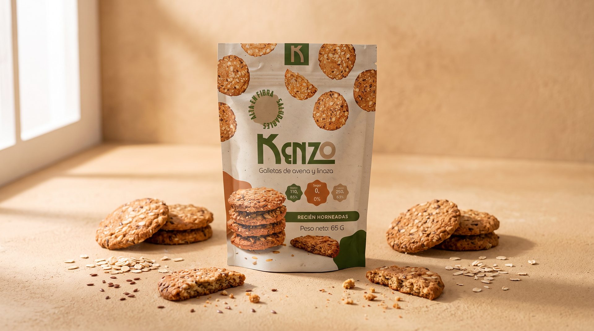
Warm and appetizing packaging for Kenzo's oat and flaxseed cookie line, balancing health-forward messaging with visual appeal.
Kenzo needed packaging that could compete on shelf while clearly communicating its natural, wholesome ingredients. The challenge was to make 'healthy' look genuinely delicious, not clinical or bland.
- Client
- Kenzo
- Service
- Packaging
- Year
- 2022
Healthy snacking, beautifully packaged
The solution uses warm golden tones, an organic logotype with friendly curves and close-up product photography that makes the cookies look irresistible. The nutritional information hierarchy was also redesigned for immediate readability.
Tools used
- + Adobe Illustrator
- + Photoshop
- + InDesign


Creative process
- 1. Competitive Analysis. Shelf audit of health food packaging, identifying gaps and opportunities in the oat snack category.
- 2. Concept & Visual Language. Development of the warm, artisanal visual language including color, type and illustration style.
- 3. Packaging Production. Final dielines for multiple SKUs, print specifications and quality control for manufacturing.


Next project
Period App