Sona Strategic Advisors
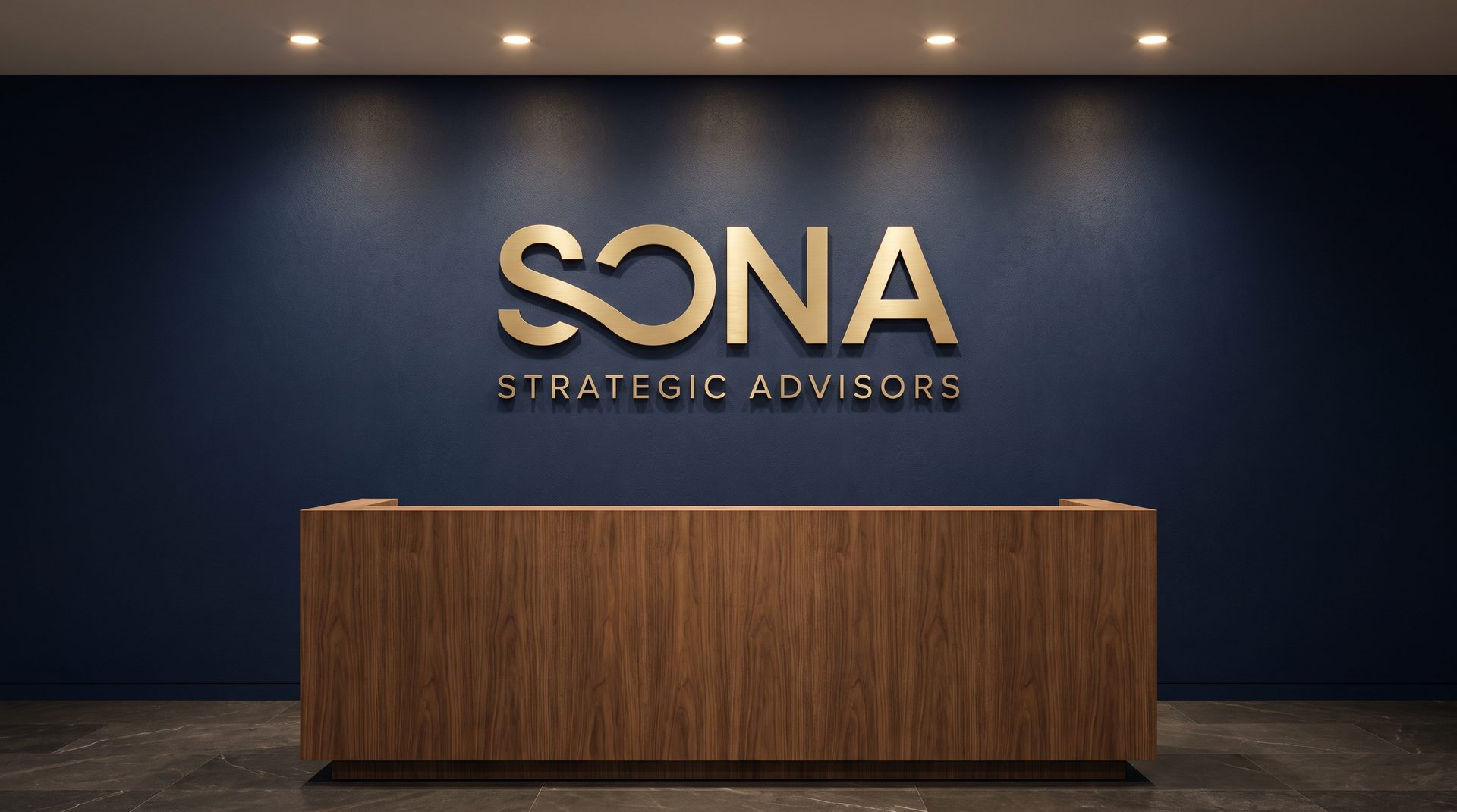
Logo design for Sona Strategic Advisors, a private capital firm that provides credit and equity backed by tangible assets.
Sona means gold in Hindi. The symbol joins an S and an O in one continuous stroke that loops like an evergreen cycle, where lender and shareholder meet.
- Client
- Sona Strategic Advisors
- Service
- Logo
- Year
- 2026
Gold, in a single continuous line
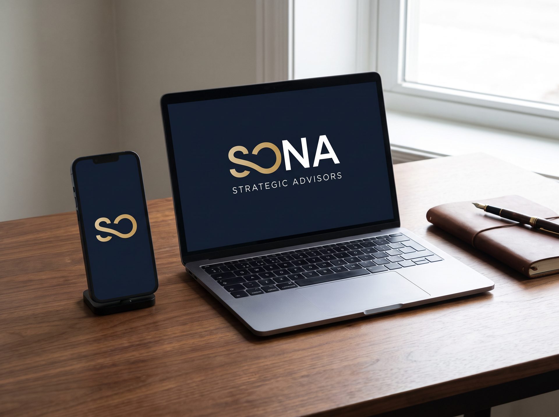
The palette pairs deep navy with a matte gold that feels like metal or an ingot rather than shine, giving the brand a calm, solid and trustworthy presence.
Tools used
- + Adobe Illustrator
- + Photoshop


Creative process
- 1. Brief and concept. Research on the firm, its investment model and the meaning of the name to define the core idea.
- 2. Proposals. Four logo directions presented with variations, typography, palette and mockups.
- 3. Final identity. Refinement of the chosen symbol and delivery of the full set of versions for light, dark and gold backgrounds.




Next project
Volantina Voladora